Flat, textureless designs disappear into their surroundings, failing to stop the eye or hold attention long enough to communicate anything. Texture and depth solve this, yet they remain one of the most underused principles in sign design. Most businesses invest in signage, then wonder why people walk straight past it. The problem is rarely the placement or the message, it’s the sign itself.
Flat, one-dimensional signs are easy to ignore. They compete with everything else in a visual environment and often lose. Texture and depth change that dynamic entirely. Through introducing physical or visual dimension, signs become easier to notice, easier to read, and more memorable all of which directly support the purpose they were built to serve.
How Texture and Depth Shape Sign Visibility
Here’s how incorporating texture and dimension into your signage improves visibility, strengthens brand presence, and enhances the viewer’s overall experience:
1. Commands Instant Attention
In any visual environment, the human eye is naturally drawn to variation. A flat sign on a flat wall disappears. A sign with raised lettering, layered elements, or tactile surfaces creates contrast against its background, and contrast is what makes something noticeable. This is why dimensional signage consistently outperforms flat alternatives in high-traffic areas.
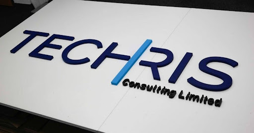
A quality print logo, for example, uses raised acrylic layers to give a company’s identity a physical presence on the wall. The depth catches light differently throughout the day, creating subtle shadow and highlight effects that keep the sign visually dynamic without any movement at all. In a reception area or entrance hall, that kind of presence is impossible to overlook.
2. Strengthens Brand Identity
Busy event spaces don’t reward subtlety. Every brand is fighting for the same eyeballs, and being seen is only half the battle, being remembered is what actually matters. Texture introduces a sensory quality that flat graphics simply cannot replicate. Dimensional and textured signage signals quality. It tells an audience that a brand has invested in how it presents itself, which in turn shapes perception of the brand’s products or services.
For event branding, incorporating depth into logos, banners, or backdrops creates a premium look that distinguishes a brand from surrounding displays. When hundreds of businesses compete for attention in the same space, textured signage gives an immediate visual edge, and that edge translates directly into engagement.
3. Sharpens Sign Legibility
Visibility is about attracting attention and ensuring a sign can be read clearly under varied conditions. Lighting changes, reflective surfaces, and viewing angles all affect how well signage communicates its message. Texture and depth help address these challenges in ways that flat graphics cannot. Raised lettering creates natural shadow lines that define each character even in low or indirect light.
Layered elements guide the eye from one part of the message to the next. For window signs, thoughtful use of material texture ensures the design remains legible from both inside and outside, at a range of angles, and in changing daylight conditions. The result is a sign that communicates reliably rather than one that only works under ideal circumstances.
4. Reduces Visual Effort
When a sign is visually complex or poorly defined, viewers must work harder to interpret it. That extra cognitive effort, however brief, reduces the likelihood that the message will land effectively. Texture and depth simplify this process by giving visual hierarchy a physical dimension.
Raised elements naturally read as more important. Recessed or background layers fall back, allowing the primary message to come forward. This instinctive depth perception, something humans process automatically, makes textured signage faster and easier to understand. Employees, customers, and visitors can absorb information at a glance rather than pausing to decode it.
5. Extends Sign Lifespan
The same qualities that make textured signs visually distinctive also make them physically resilient. Signs with depth are frequently made from more robust materials, giving them a longer lifespan and maintaining their appearance over time. A sign that fades, warps, or loses definition quickly becomes a liability rather than an asset.
Dimensional signage holds its form and finish far longer than printed flat alternatives. The physical structure of raised elements means there’s no surface to peel, crack, or fade in the same way. This makes textured signage a more practical long-term investment, particularly for permanent or semi-permanent installations.
Making Texture Work For Your Signage
Most signage decisions focus on colour and font. Texture and depth rarely enter the conversation, but they should, because they do more for visibility than either. From drawing the eye in a busy environment to improving legibility and reinforcing brand quality, dimensional signage consistently delivers results that flat alternatives cannot match.
The goal of any sign is to communicate clearly and be remembered. Texture and depth are among the most reliable ways to achieve both. They sharpen legibility, strengthen brand recall, and give signage a physical presence that flat designs simply cannot replicate, making dimension one of the smartest investments a business can make.